
On 11 March 2020, the World Health Organization declared COVID-19, the disease caused by the virus SARS-CoV-2, a pandemic. A year later, nearly 130 million cases of COVID-19 have been confirmed worldwide, and nearly 3 million deaths [see the Wikipedia article COVID-19 pandemic and references therein].
Viruses are small. They are approximately spherical with a diameter of 50-200nm (see this research paper in the Lancet) and showing the spikes which make them look something like a crown (hence the name coronavirus):
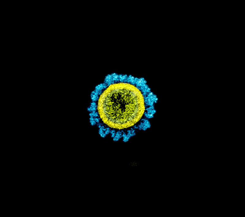
While they are small, the genetic data contained within a virus is dangerous: once it gets inside a cell (which is where those spikes come in!), the single strand of RNA from the SARS-CoV-2 virus subverts the cellular machinery to make many more copies of the virus particle
Which got me wondering, in March 2020
The genetic sequence for SARS-CoV-2 is available on the website of the wonderful National Center for Biotechnology Information, where one version is known as NCBI Reference Sequence: NC_045512.2. This sequence contains 29,903 bases draw from the four-letter alphabet of nucleotides on a strand of RNA. Four letters can be encoded in two bits, or 1/4 of a byte. So we have something of an aswer to the question of how big, information-theoretically, is this virus:
If you work a lot with data, 7.3KB may mean something to you intutively. That's fine, but the rest of this piece is for people who may not have such a fine-grained intution for data sizes.
One place people today are accustomed to seeing large quantities of data is in images. A digital image is made up of many small dots: pixels. Modern displays can show pixels of many colors, often specified by RGB (="Red-Green-Blue") values which can take any whole number value from 0 to 255. That is, a color pixel represents three bytes of data ... or twelve bases of genetic data. In fact, if we use this approach to make an image for the SARS-CoV-2 virus genome, we get the following image:

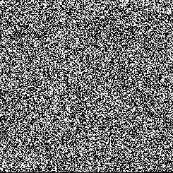
For folks with color perception issues, let's make a black-and-white version. If each pixel can be either black or white, then one pixel would represent only on bit of data, and two (adjacent) pixels could be used to represent one genetic base.
Several vaccines against COVID-19 are mRNA vaccines, meaning that their most important component is a fragment of mRNA. What is used is the RNA which codes for one of the virus's spike proteins, and somehow (don't ask me, I'm not a biologist), the immune system uses this information to make antibodies to that spike. That way, your body is ready when it encounters the actual virus particles to fight them off.
The mRNA sequence for the Moderna vaccine is described in an article Assemblies-of-putative-SARS-CoV2-spike-encoding-mRNA-sequences-for-vaccines-BNT-162b2-and-mRNA-1273. Apparently, the sequence is 4,004 bases long, meaning that it contains a little bit less than 1KB of data.
Displaying the vaccine genetic sequence in the same way we did for the virus itself, at the same resolution, yields this image:

Or, for folks with color perception issues, we get the following black-and-white image of the Moderna sequence:

[There is a strange apparent vertical striping in this image, which is not an artifact of the display, but instead says something about the sequence it represents. This seems to have been noticed by biologists, see Alonso, Andres Mariano, and Luis Diambra. "SARS-CoV-2 codon usage bias downregulates host expressed genes with similar codon usage." Frontiers in cell and developmental biology 8 (2020), available online at this NCBI URL.]
Maybe you don't feel satisfied that that image display gives a good intuition of how much information there is in the virus genome itself or in the sequence of the vaccine. I'm not sure I do.
One way to get a better intuitive feeling might be to juxtapose those genetic sequence images with a similar quantity of other image data. Here is a low-resolution version of well-known image, with the virus and vaccine sequences, in their visual representations as above, superimposed at the same resolution.
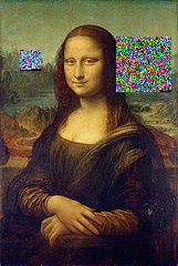
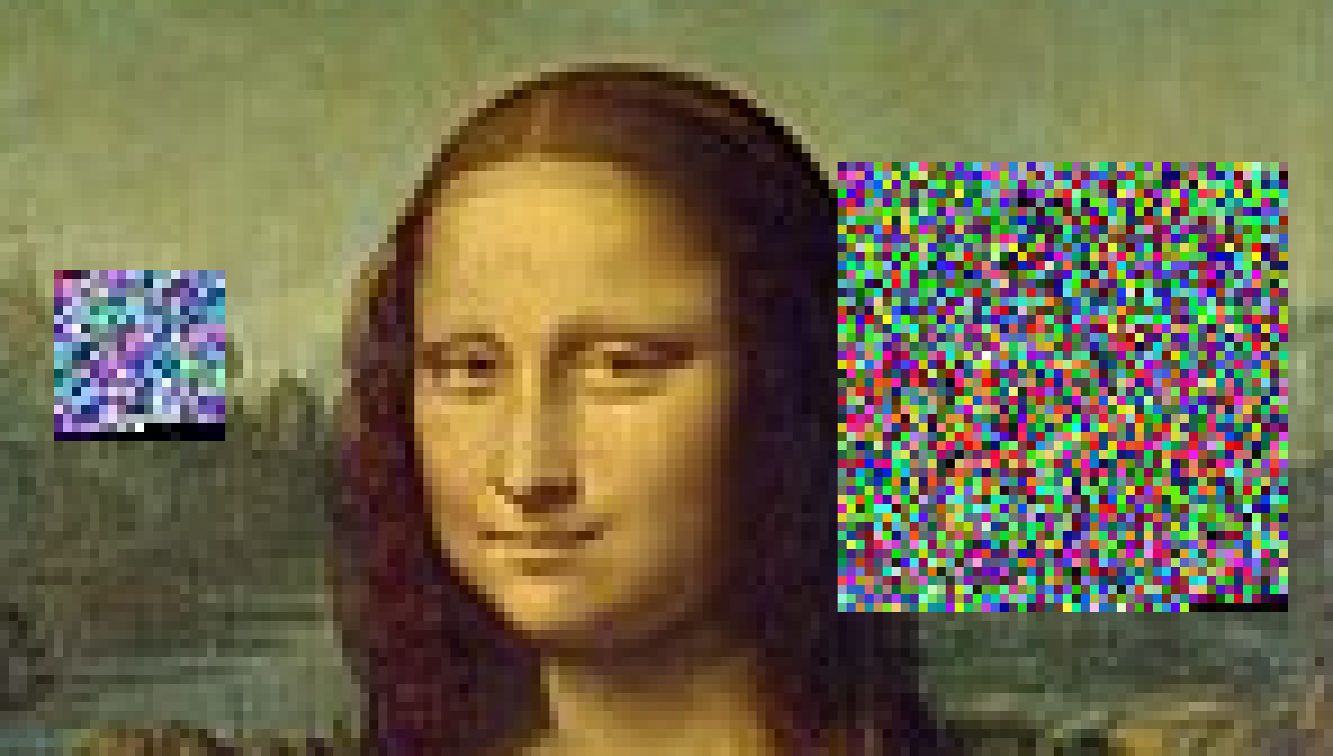
It might seem that there is more information per unit area in the genetic sequence sub-images here and that the pixels in those sub-images are bigger than in the background Mona Lisa. But that is probably due to the fact that Leonardo is using mostly a more smoothly varying choice of colors over nearby pixels: in fact, the pixels are the same size, as can be seen by this close-up:
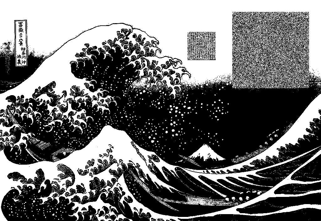
As before, for folks with color perception issues, let's make a black-and-white version which compares the information content of the virus and vaccine images to another image at the same resolution.
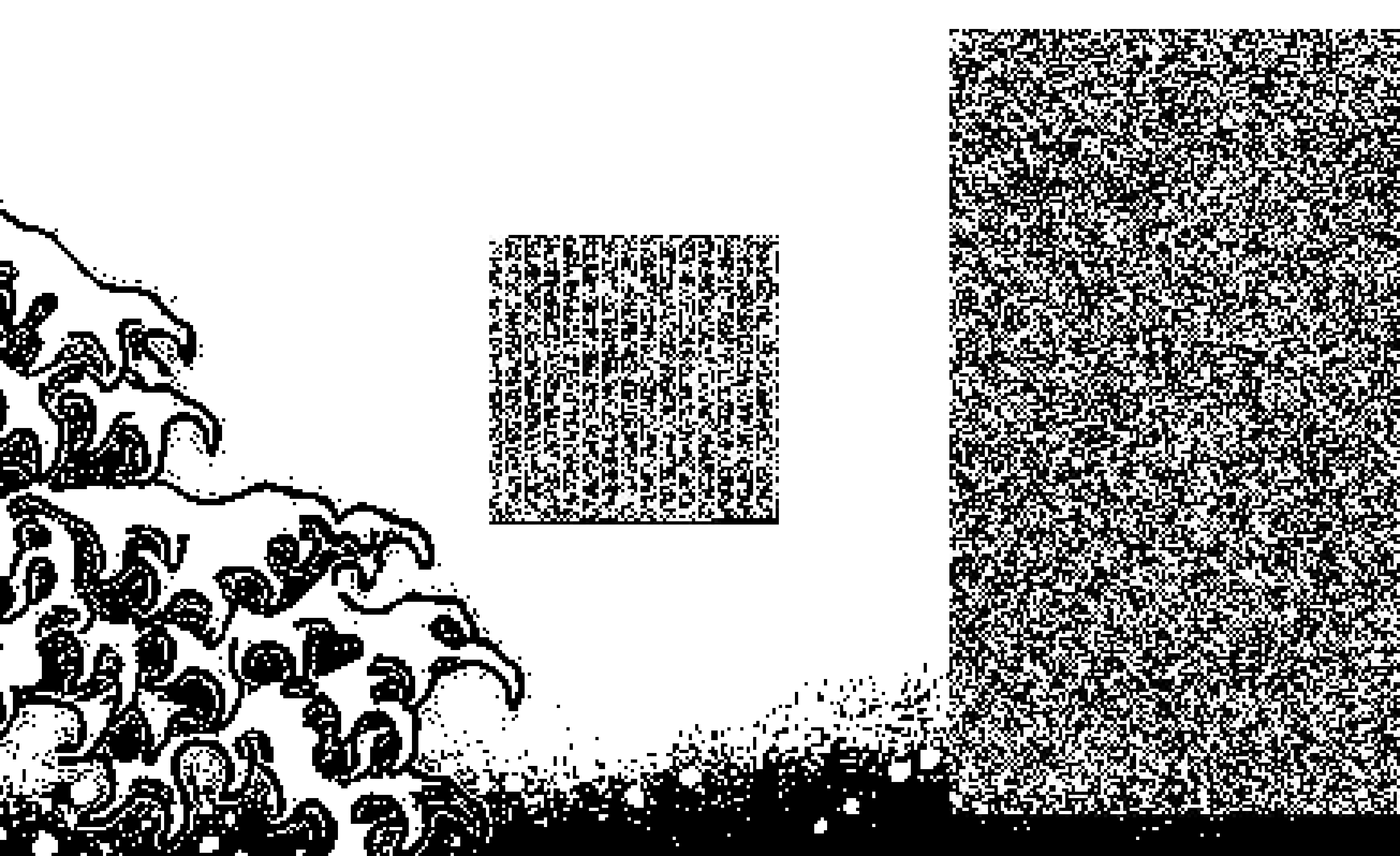
Also as before, let us zoom in to show that the pixel sizes of the sub-images for the genetic sequences are the same as for the background
Hopefully, this exploration gives some idea of how big, informationally,
are the SARS-CoV-2 virus and one of the mRNA vaccines against it.
In the spirit of scholarly openness, I want to explain how I made those visual representations of the genetic sequences.
The sequence data was taken from sites already mentioned above. Note that the files were edited so that they contained only sequence data and no other characters, even newlines.
The background images of The Mona Lisa and The Great Wave at Kanagawa were both downloaded from Wikimedia Commons.
Then on my Linux box running Linux Mint 19.3 Tricia and with Python3 (version 3.6.9), I ran the script make_image.py as follows:
./make_image.py --input_file virus_sequence --output_file color_virus_image
./make_image.py --input_file virus_sequence --bw --output_file BW_virus_image
./make_image.py --input_file vaccine_sequence --output_file color_vaccine_image
./make_image.py --input_file vaccine_sequence --bw --output_file BW_vaccine_image
Those resulting images (manipulated a little with the GIMP, and sometimes incorporating the famous backgrounds) are what appears above.
[Note that the script above is distributed under a GNU GPLv3 license, so feel free to use and adapt it to your needs.]
